Explore Cardiff through data (this site is a work in progress)
Dive into a visual journey of Cardiff’s commuting patterns, air pollution trends, and other census metrics told through custom maps. Each gallery tab highlights a different perspective. I will continue to update these and improve upon them (08/08/25).
Below is an interactive map showing commuter patterns for different local authorities. In 2024, Cardiff had the highest rate of commuters into the region and this has generally been true for other years.
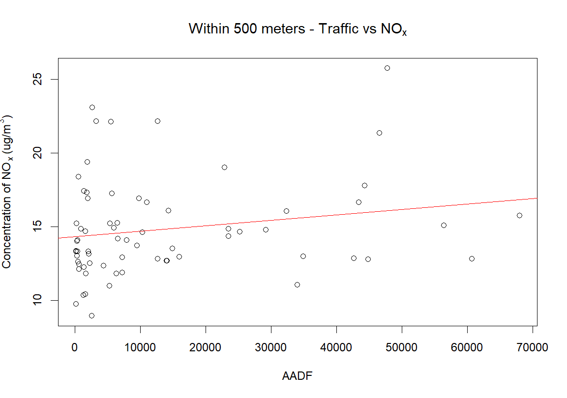
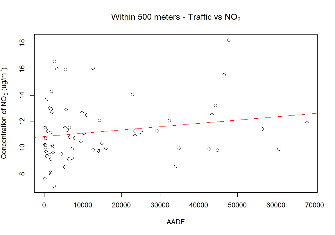
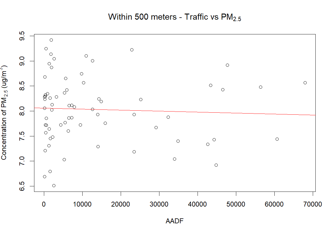
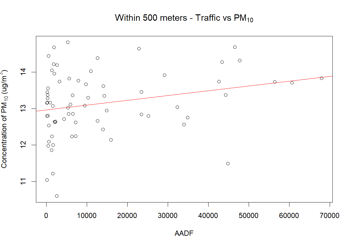
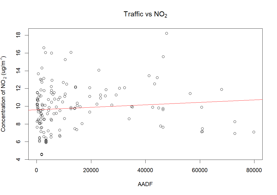
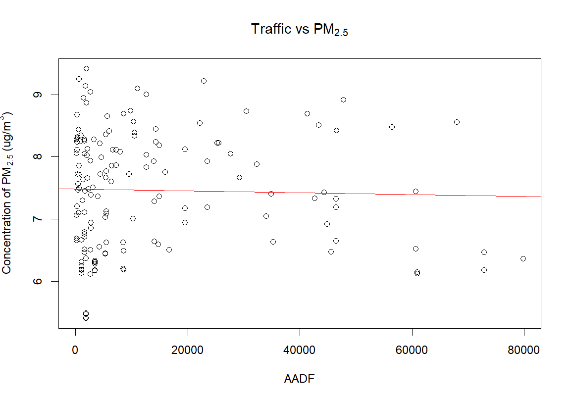
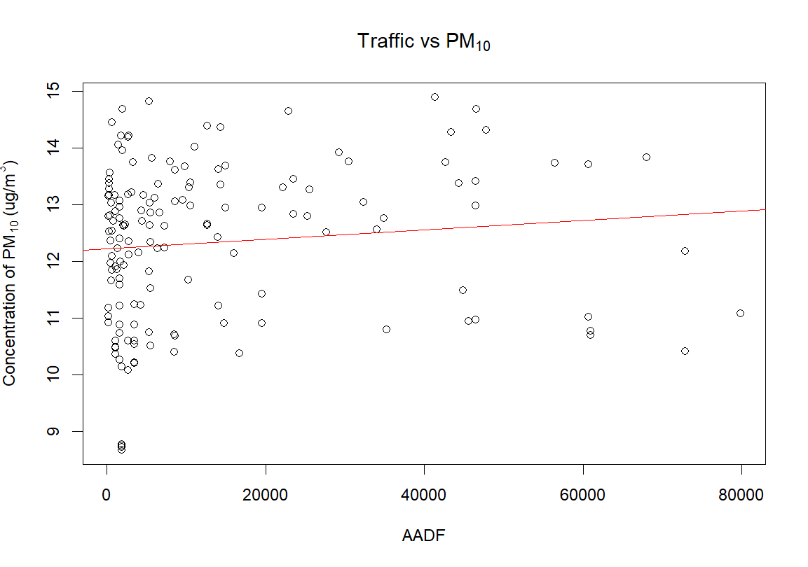
Below are maps linking 2024 traffic annual average daily flow, industry sites, modeled background map concentration data, and road density. It can be seen that the highest concentrations of air pollution are found nearer the center of the city where highways converge and along highways with higher adjacent road density.
As you explore, please give the maps a moment to load - these are large files.
As you explore, please give the maps a moment to load - these are large files.
NO2 Concentrations in Relation to Traffic and Industry Sites
NOX Concentrations in Relation to Traffic and Industry Sites
PM2.5 Concentrations in Relation to Traffic and Industry Sites
PM10 Concentrations in Relation to Traffic and Industry Sites
In this column are maps linking the closest nearest traffic monitor 2024 annual average daily traffic measurements to center points of modeled background air pollution.

This column shows the same as the left column but any distance above 500 meters between traffic monitor and center point of modeled air pollution has been removed.